Generating Visuals Without Inventing Facts
The problem
Ask a generative tool for an infographic about your work and it will produce something competent-looking that contains a number you never measured.
Not maliciously — a layout has a slot, the slot wants a figure, and the model supplies one with the same confidence it applies to everything else. The result is a diagram that is 90% true, and the 10% is the part a reader checks first.
On any site making evidence-backed claims, that is fatal. One invented number discredits the honest ones beside it, and the reader has no way to tell which is which.
The pattern
Three controls. None of them are about prompt engineering.
1. The brief is a whitelist, not a reference. A single document lists every fact a visual may use. If a number is not in it, the number does not appear — the prompt says so explicitly, and the instruction to leave the space empty rather than fill it is the load-bearing part.
The inclusion test worth using: has this fact already passed whatever review your published material goes through? Here that means it is already on the site. A generation brief is not the place to settle a disclosure question, because that decision deserves more care than a paragraph written in a hurry.
2. The corpus is derived, and scanned at assembly. A script copies canonical sources into one folder, scans the result for anything that must not leave the building, and deletes the output rather than shipping a corpus that fails. It fails closed, because that folder is about to be uploaded to a third-party service.
Scan the corpus as a whole, not file by file. A term survives one file's review and appears in another.
3. Every artefact is a task, not a prompt. A task names what grounds it, what it must produce, where the output will live, and what would make it unacceptable:
| Field | Purpose |
|---|---|
| Artefact | Diagram, infographic, deck — pick the smallest that carries the point |
| Use case | Where a reader meets it and what they take away |
| Sources | The specific files that ground it |
| Grounding facts | The figures used, so they can be re-checked |
| Destination | Where the output lands and which page references it |
| Must contain / must not contain | The non-negotiables and the failure modes |
| Acceptance | What must pass before it ships |
The three in bold are the ones people skip, and they are the ones that make an artefact auditable six months later when somebody asks where a figure came from.
The pipeline
Return is the stage that gets skipped, and it is why people accumulate folders of unused images. An artefact that never comes back into the repository, referenced from the page it argues for, is not part of the argument.
The loop back matters too: if laying an argument out visually exposes a gap — and it does, more often than expected — fix the source and rebuild. Never patch only the image.
The verification gate
Before anything is committed:
- Every number traced back to the brief
- No confidential term anywhere in the image, including small print, legends and axis labels — that is where they survive a careless review. Zoom to 200% and read every label
- Maturity stated honestly: a prototype looks like a prototype, an unbuilt project does not look built
- Limitation panels at equal weight to capability panels — generators shrink bad news by instinct
- Readable desaturated, and at one-third size
- Meaning never encoded in colour alone
Fails any of these → regenerate. Do not hand-patch: a hand-patched image has no reproducible source, which defeats the whole arrangement.
The working prompts
These are this site's actual generation tasks, not illustrations. They assume two uploaded documents — a source brief and a style guide — and are written for NotebookLM, though the shape transfers.
Note the pattern in each: the sanitisation rule is repeated inline, even though it is already in the brief. A prompt gets copied away from its context, and the rule has to travel with it.
Route divergence
The strongest of the set: a measured result that contradicts the architecture diagram everyone had been reviewing.
You are a technical diagram designer. Follow every rule in the uploaded
STYLE-GUIDE.md. Use only facts from the uploaded SOURCE-BRIEF.md.

Create a single diagram titled "What the evaluation harness caught".

Subject: an evaluation harness recorded which retrieval path each test
question was DESIGNED to exercise, against the path it ACTUALLY took.
Three of four specialised paths diverged.

Layout: two parallel vertical columns, "Designed" on the left and
"Actual" on the right, with flow lines connecting them. Draw four rows,
one per designed path. Where the designed path and actual path match,
the line is straight and grey. Where they diverge, the line bends across
to a different destination and is drawn in the accent colour.

Rows, using exactly these figures:
- Deterministic lookup via governed functions — 4 questions — all four
  arrived at hybrid retrieval
- Lightweight relationship lookup — 2 questions — both arrived at hybrid
  retrieval
- Graph traversal — 4 questions — all four fell through to a bare model
  answer, because a tool endpoint was unreachable
- Hybrid retrieval and hierarchical summarisation behaved as designed

Below the diagram, in a bordered band spanning the full width, set this
sentence in large type as the conclusion:

"The answers still looked fine."

Then, in smaller type beneath it: "Three of four specialised paths were
not behaving as the architecture described. Nothing in the output — not
the text, not the citations, not the tone — would have revealed it."

Do not name any internal system or component. Use only the functional
route names given above.
A capability ladder
Where the interesting content is the cost of each step, not the steps.
You are an infographic designer. Follow every rule in the uploaded
STYLE-GUIDE.md. Use only facts from the uploaded SOURCE-BRIEF.md.

Create a single-page infographic titled "Evaluation is a capability, not
a metric".

Open with this claim, set as the largest text on the page:

"An evaluation capability's first job is consistency, not correctness."

Main element: a five-step ascending staircase, left to right. Each step
is a panel carrying its name, what it buys, and what it costs. Use these
exactly:

1. Instrument — buys: something observable at all — costs: engineering
   time, days to weeks
2. Consistency — buys: change detection, regressions become visible —
   costs: discipline
3. Correctness — buys: absolute judgement, is this answer good — costs:
   expert time and CALENDAR, months
4. Thresholds — buys: agreement on where the line sits — costs:
   organisational authority
5. Gate — buys: a release can actually be blocked — costs: political
   capital

Draw a prominent arc arrow leaping from step 1 directly to step 5,
rendered in the accent colour and labelled: "Where most programmes try to
jump — then abandon the effort as premature."

Emphasise step 3 as the expensive one. Its cost is calendar time, not
effort, and it cannot be compressed by working harder.
Parallel things that generators want to draw as a funnel
The layout instruction here exists because the default output was a pipeline, three times running.
You are a technical diagram designer. Follow every rule in the uploaded
STYLE-GUIDE.md. Use only facts from the uploaded SOURCE-BRIEF.md.

Create a single diagram titled "Three instruments, three kinds of
blindness".

Layout: three equal columns side by side. Each column is one instrument.
Give the "sees" and "blind to" halves EQUAL visual weight — the
limitation is as important as the capability, and must not be styled as
a footnote.

Column 1 — Automated competency-question harness
  Sees: routing behaviour, latency, consistency between runs
  Blind to: whether answers are correct; anything outside the question set

Column 2 — Structured human feedback workbook
  Sees: what the business considers wrong, missing or unacceptable
  Blind to: anything nobody thought to ask; slow in calendar time

Column 3 — Independent pipeline review
  Sees: structural defects in the corpus and the machinery producing it
  Blind to: runtime behaviour entirely

Beneath the three columns, spanning the full width, set this as the
conclusion in large type:

"A retrieval failure caused by a chunk cut mid-sentence looks exactly
like a retrieval failure caused by a bad query."

Do not merge the three into a single funnel or pipeline. They are
parallel and independent; the layout must show that.
A lineage where real and invented things sit together
The structural encoding rule — shape rather than colour — is what makes this survive greyscale and colour-vision deficiency.
You are a technical diagram designer working in the register of an
adaptation-studies paper or a museum wall panel. Follow every rule in the
uploaded STYLE-GUIDE.md and STYLE-SUPPLEMENT.md. Use only facts from the
uploaded SOURCE-BRIEF.md.

Create a single diagram titled "Where story and reality cross".

Layout: a horizontal timeline, left to right, 1972 to 2024.

Distinguish real from fictional STRUCTURALLY, not by colour: real-world
entities take a solid border and square corners; works of fiction take a
dashed border and rounded corners.

Draw labelled, typed relations between the nodes — adapted_from,
inspired_by, depicts_real_place, anticipates — and one return edge
labelled shapes_perception running backwards from the later works to the
real place.

Render the anticipates edge distinctly, because it runs forward in time
between a work and an event rather than between two works. Do NOT make it
the loudest element and do NOT label it prediction, prophecy, or foresaw.

No genre imagery of any kind. Original diagram only.
A single typographic point
Sometimes the whole argument is one detail, and the restraint is what makes it land.
The subject here: a game series retitled from Shadow of Chernobyl (2007) to Heart of Chornobyl (2024) — Russian transliteration to Ukrainian, from the same Ukrainian studio. A work of fiction altering itself to track a political reality.
You are a designer making a single, quiet, typographic image. Follow every
rule in the uploaded STYLE-GUIDE.md. Use only facts from the uploaded
SOURCE-BRIEF.md.

Create a square image built around one change in spelling.

Show, large and centred:

  2007   Shadow of Chernobyl
  2024   Heart of Chornobyl

Set the two spellings so the single differing letter is unmistakable,
without gimmickry — no highlighting in a bright colour, no circling, no
arrows. Typographic weight and position only.

Beneath, smaller: "Russian transliteration to Ukrainian. Seventeen years
apart, from the same Ukrainian studio."

And smaller still, as the conclusion: "A work of fiction altering itself
to track a political reality."

Nothing else on the image. No decoration, no imagery, no flags, no
symbols. The restraint is the point.
The specifics are load-bearing
An earlier version of this page carried the same prompt with the two variants removed, to keep it generic. It became unrunnable: given no variants, a generator invented a pair — artefact versus artifact — and produced a confident image about nothing.
That is the whole argument of this page, demonstrated at my own expense. A prompt with a hole in it does not fail loudly; it fills the hole.
What it produces, and what it rejects
Five artefacts were generated from these prompts in one session. Three passed, two failed, and the failures are more instructive than the successes.
Passed
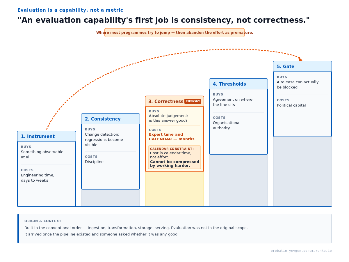
Kept as an image because the ascending staircase is the point — a diagram-as-code version would flatten it to boxes in a row. Two defects to fix before this is published in the whitepaper: the leap label overlaps its own border, and the leap is drawn in orange rather than the palette gold.
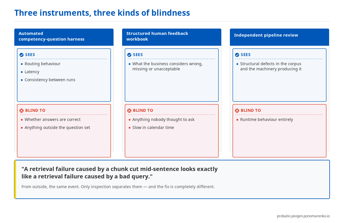
The layout instruction worked: three parallel columns rather than the funnel the generator produced on earlier attempts, with the limitation panels at equal weight. It dropped one figure the task asked for.
The third, a route-divergence diagram, was good — correct figures, on palette, the conclusion landing — and was still superseded by Mermaid, because a flow graph belongs in the page as editable code rather than as a PNG. It survives as an export for slides.
Failed
Both failures were the same mechanism, and neither was caught by the generator.
One produced an entirely invented lineage node — a plausible-sounding Modern expanded media entry that appears nowhere in the brief — alongside a date range contradicted by the brief's own table.
The other is the one described above: given a prompt with the specifics removed, it invented a spelling comparison about nothing and stated it with total confidence.
Neither failed loudly. Both produced clean, well-composed, professional-looking images. That is the entire reason the verification gate is a separate step performed by a person, and not something the generator can be asked to do for itself.
What goes wrong
| Symptom | Cause | Fix |
|---|---|---|
| A number appears that is not in the brief | The generator filled a slot the layout implied | Regenerate. Then ask whether the layout needed a number there — usually not |
| The set looks unrelated | Style guide not uploaded, or not referenced in the prompt | Both, every time |
| Limitation panel is tiny | Generator default: bad news gets small type | Say "equal visual weight" explicitly, and reject output that ignores it |
| Parallel things drawn as a funnel | Generators default to pipelines | State "parallel and independent; the layout must show that" |
| Visual contradicts the page it sits on | Stale corpus | Rebuild before every session |
| A confidential term in a legend | The headline was reviewed, the small print was not | Zoom to 200% and read every label |
| An unbuilt project looks built | The brief did not say it was not | State it in the brief and in every prompt |
When this does not apply
- Exploratory or throwaway visuals — thinking aids, whiteboard equivalents, anything that will not be published. The machinery costs more than it returns.
- Where no facts are involved. A conceptual diagram with no figures needs a style guide, not a whitelist.
- Where you would not publish the underlying claim anyway. The gate does not make an unpublishable fact publishable; it only stops an invented one getting through.
Related
- Competency questions as an evaluation gate — the same instinct applied to system quality rather than to diagrams
- Fail loud in knowledge systems — why silent partial failure is the expensive kind